Ine Vermee
3 Sep - 23 Oct 2005
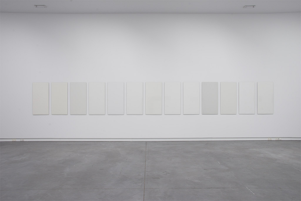
The work of Ine Vermee (Tilburg 1954) is subdued and tranquil. Series of color planes are carried out in various techniques and presented in an austere manner. With this Vermee joins a long tradition of abstract-geometric art, minimalism and systematic color studies. For her it all began with a great admiration for the work of Jan Schoonhoven. His white reliefs were based on a clear concept and simplicity of visual means but were, at the same time, varied and full of nuance. Limitation proved to yield a wealth of possibilities. Vermee has continued on this path, narrow as it may be, and has carried out a consistent investigation of the monochromatic and the material. Not as interested in the work's 'personal handwriting' to the extent that Schoonhoven had been, she has more concern for the procedure by which a work is made. Her works are made with lacquer, enamel, cloth and inkjet - a range of materials and techniques that lead to different results with respect to surface, texture, the effects of light and color. Here the main focus is how the colors and nuances of color relate to each other, how they emerge in successions and gradations, and what different materials and techniques can generate. Through these investigations, Vermee became fascinated with color gradations. For a series of 'whites', carried out in enamel, she used a color sample by the well-known American architect Richard Meier (Thirty Colors 2004) as the point of departure. This series clearly demonstrates that, just as there are many words for snow in the Icelandic language, there is not simply one kind of white. Ine Vermee seeks subtlety and concentration rather than a grand gesture or the expression of emotion. She strives for clarity, simplicity and perfection. The vocabulary with which she conveys this consists of colors and forms that can give rise, in their combinations and coherence, to surprising and nuanced statements.
website of the artist
website of the artist